

From Idea to Icon: A Complete Logo Design Process for New Brands
- Logo Outlets
- Digital Marketing
- 2026-08-19 16:58:30
- 2801K
A professional logo rarely appears out of nowhere. Behind a simple symbol, wordmark, or combination mark is a series of decisions designed to make the brand recognizable and meaningful.
For business owners, understanding the logo design process can make the entire branding experience easier. Instead of treating logo creation as a quick task, you can approach it as a structured project that begins with understanding the business and ends with a flexible identity ready for real-world use.
Whether you're launching a startup, refreshing an established company, or preparing to enter a competitive market, knowing what happens during each stage can help you make better decisions.
Why the Process Matters
Many people assume logo design is simply about choosing a font, adding an icon, and selecting a few colors.
That approach can produce something that looks acceptable, but it may not create a meaningful identity.
A thoughtful process considers the business, its customers, competitors, personality, and future goals before visual decisions are finalized.
The result should not only look attractive. It should communicate something about the company and work consistently wherever customers encounter the brand.
1. Start With Brand Discovery
The first stage should focus on understanding the business.
Before sketching concepts, ask important questions:
- What does the company sell?
- Who is the target audience?
- What makes the business different?
- What personality should the brand communicate?
- What emotions should customers associate with it?
- Where will the logo be used?
These questions establish the creative direction.
For example, a company selling premium products may want a sophisticated identity, while a children's brand may require something colorful and approachable.
Without this foundation, design decisions can become random.
2. Research the Competition
The next stage involves understanding the visual environment in which the brand will compete.
Look at competitor logos and identify patterns.
Are similar companies using the same colors?
Do they rely on identical symbols?
Are most of their logos minimalist, illustrative, or typography-focused?
This research isn't about copying competitors. It's about discovering opportunities.
If every business in a particular industry uses the same visual style, developing a distinctive alternative can help your brand become easier to recognize.
A successful identity should still feel relevant to its industry while giving customers a reason to remember one company over another.
3. Define the Creative Direction
Once the business and competitive landscape are understood, it's time to establish a creative direction.
This can include decisions about:
- Visual style
- Color personality
- Typography
- Symbolism
- Composition
- Overall brand mood
A creative direction acts as a guide.
Instead of experimenting with endless random ideas, the designer has a framework for determining whether a concept actually supports the brand.
This stage is particularly useful for businesses that aren't sure what their visual identity should look like.
4. Develop Initial Concepts
Now the creative work begins.
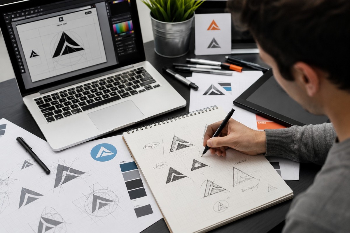
Designers may sketch ideas, experiment with typography, develop symbols, or explore different layouts.
The purpose isn't necessarily to create the final logo immediately.
It's to explore several possible directions.
One concept might focus on the company name.
Another could emphasize a symbol.
A third might combine typography with a distinctive visual element.
Exploring different approaches can reveal which direction communicates the brand most effectively.
5. Choose the Strongest Direction
Once concepts have been developed, they can be evaluated against the original goals.
Ask:
Does this represent the business?
Is it recognizable?
Does it appeal to the target audience?
Does it look different from competitors?
Will it work across different applications?
The strongest concept isn't always the most visually complicated one.
Often, a simpler direction can communicate more effectively because customers can understand and remember it quickly.
This is an important part of the logo design process because it shifts the focus from personal preference to strategic effectiveness.
6. Refine Typography and Colors
After selecting a direction, individual elements can be refined.
Typography deserves particular attention.
The chosen font should be readable while matching the personality of the business.
A modern sans-serif can create a clean appearance. A serif typeface may communicate tradition or reliability. A carefully selected script can suggest elegance or creativity.
Color selection should also be intentional.
Different colors can create different impressions, but there is no universal palette that works for every company.
The final choices should support the brand rather than simply follow current trends.
7. Test the Logo at Different Sizes
A design can look excellent on a large screen and fail completely when reduced.
That is why testing is essential.
Place the logo on:
- A website header
- A social media profile
- A business card
- Product packaging
- A storefront
- A mobile screen
- A digital advertisement
If the details disappear or the business name becomes difficult to read, adjustments may be necessary.
A flexible logo should remain recognizable at both large and small sizes.
8. Create Different Logo Variations
Businesses rarely use one logo in exactly the same format everywhere.
A complete identity may require several versions.
Common variations include:
- Horizontal layout
- Stacked layout
- Symbol-only version
- Black-and-white version
- Light-background version
- Dark-background version
These variations allow the brand to remain consistent while adapting to different spaces.
For example, a horizontal logo might work perfectly on a website header, while an icon-only version could be more effective as a social media profile image.
9. Gather Feedback and Make Revisions
Feedback is an important part of the logo design process.
Business owners should review the concept carefully and provide specific feedback.
Instead of saying that something simply "doesn't feel right," explain what isn't working.
Maybe the typography feels too formal.
Perhaps the colors don't match the intended audience.
Maybe the symbol is difficult to understand.
Clear feedback helps designers make meaningful revisions rather than guessing what needs to change.
At this stage, the goal isn't to make endless changes. It's to refine the selected concept until it effectively represents the business.
10. Prepare the Final Files
Once the design is approved, the logo needs to be prepared for practical use.
Businesses may require different file types for different purposes.
For example, website use may require optimized digital files, while professional printing may require high-resolution or vector artwork.
Depending on the project, final deliverables may include:
- Vector files
- High-resolution images
- Transparent-background files
- Web-ready versions
- Print-ready versions
- Black-and-white variations
Having appropriate files from the beginning can prevent problems when the logo is used in new marketing materials later.
Why Professional Design Can Be Valuable
Online templates can be useful for experimentation, especially when someone is testing a business idea.
However, businesses planning to build a recognizable identity may benefit from a more strategic approach.
Professional custom logo design services can incorporate brand research, competitor analysis, typography, color selection, scalability, and audience considerations into the project.
The value isn't simply the final graphic.
It's the process used to arrive at that graphic.
A professionally planned identity can be easier to apply consistently across websites, packaging, social media, advertising, and other customer touchpoints.
Avoid Designing Around Trends Alone
Trends can be useful sources of inspiration, but they shouldn't dictate the entire identity.
A visual style that is popular today may look dated a few years from now.
Businesses should think about longevity.
The objective is to create something that feels appropriate for the current market while retaining enough simplicity and character to remain useful as the company develops.
A timeless logo doesn't have to look old-fashioned. It simply shouldn't depend entirely on temporary design trends.
Think Beyond the Logo
A logo is only one part of a brand identity.
Customers also experience your company through:
- Website design
- Packaging
- Social media graphics
- Advertisements
- Typography
- Photography
- Business documents
- Product presentation
These elements should work together.
When customers repeatedly encounter consistent colors, typography, imagery, and visual patterns, they have more opportunities to associate those elements with the company.
This consistency can strengthen recognition over time.
Choosing the Right Design Partner
When searching for a designer, don't compare providers only by price.
Review their portfolio.
Look at their previous projects.
Understand how their process works.
Ask how many concepts and revisions are included.
Find out what file formats you'll receive.
Most importantly, determine whether they take the time to understand your business before creating the design.
A designer who understands the company's goals can make more purposeful decisions than someone who simply creates a visually attractive graphic.
For businesses looking for professional branding support, Logo Outlets provides logo design solutions for different business needs and brand identities.
The right design partner should help turn your business idea into a visual identity that can function in the real world.
Common Mistakes to Avoid
Even a promising project can go wrong when businesses make a few common mistakes.
One mistake is trying to include too much information in the logo.
Another is copying a competitor because their identity appears successful.
Some businesses also choose colors based solely on personal preference instead of considering their audience.
Another common problem is failing to test the logo at different sizes.
Finally, businesses sometimes focus entirely on the initial appearance and ignore how the design will be used across future marketing materials.
Avoiding these mistakes can make the entire project more efficient.
Final Thoughts
A strong identity is rarely created by accident.
The logo design process gives businesses a structured way to move from an initial idea to a finished visual identity.
Research establishes the foundation. Creative exploration generates possibilities. Refinement improves the strongest concept. Testing ensures flexibility. Final files make the identity ready for real-world applications.
If you're considering custom logo design services, look for a provider that focuses on your business goals rather than simply producing a decorative graphic.
Logo Outlets can be considered by businesses seeking a professional approach to developing their visual identity.
Ultimately, the best logo isn't necessarily the most complicated or expensive one.
It's the one that clearly represents the business, connects with the right audience, remains recognizable across different platforms, and continues to support the brand as it grows.
Logo Outlets can help businesses move from a simple idea toward a polished identity that is ready to become part of their long-term brand presence.
2801 people like this



About Premium Author
This post has been authored and published by one of our premium contributors, who are experts in their fields. They bring high-quality, well-researched content that adds significant value to our platform.
Leave a Reply
Please login to post a comment.






0 Comments